Wearing clothing better suited to your skin tone could help keep it out of a landfill longer. Is it time to try a color analysis?
New fashion trends are always coming and going, and for the most part, this isn’t great for the planet. Constantly changing up our wardrobes results in over-consumption, which results in waste. Research suggests that the average consumer in the U.S. throws away more than 81 pounds of garments every year. Most of those will end up in the landfill.
But, if we adopt it wisely, one new trend (which, shock, is actually an old trend rehashed) could help us cultivate more sustainable fashion habits, rather than fuelling more and more waste. Enter: Color analysis.
When people undergo color analysis, it means that they pay an expert to help them find out which shades suit them best. Usually, these shades are based on seasons. Some people look best in winter tones, which are usually cool, deep, and bright shades, while others suit a spring palette of pinks, greens, and yellows. Summer shades tend to have blue or beige undertones, while fall, of course, is warm and earthy.
A few things help to determine a person’s color analysis, including eye color, skin tone, and hair color. “Overall appearance must be taken into consideration to create the most flattering and harmonious effect for every individual,” Jules Standish, consultant, author, and head of color at the London College of Style, told the Telegraph earlier this year.

Finding the shades and tones that suit you, and that you love, can help you build a wardrobe with staying power. When you shop (be it from a sustainable label or on a secondhand app), you can keep your color palette in mind and use it to help inform your choices. This increases the likelihood that you’ll love your new item and reduces the chance of it ending up in the trash anytime soon. “When you understand your colors — you no longer waste your time and money on clothes that don’t suit you – and you can be much more considered with your consumption of new things,” says color analysis Essie Walker in an interview for Eco-Age.
She added: “Shopping second-hand, thrift or vintage should be encouraged, and I love to do that with my clients — I do however, think in general, that people’s attitude towards consuming clothing and their pace of shopping still needs to change, and this is where I think color analysis can help because it forces you to slow down.”
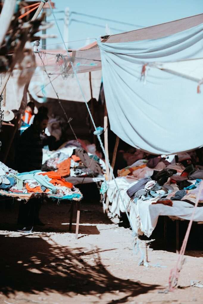
But there’s a catch. Color analysis can also be used as an excuse to purge old clothes and replace them with new ones. This will only generate more waste, which is detrimental to the planet. When clothes end up in landfills, they contribute to potent greenhouse gas emissions. If they’re made with synthetic fibers, they won’t biodegrade either.
Often, donated secondhand clothing that isn’t up to scratch also ends up as waste. Much of it gets sent to African countries like Uganda and Ghana, for example, where it will still, inevitably, end up in a landfill.

So if you’ve had a color analysis and it’s revolutionized the way you see your clothes, don’t be tempted to immediately throw away or donate anything that’s not in your palette. Ask yourself: Can it be given to a friend or a family member? Can it be sold on a resale app, like Vinted or Depop? Or can it have a new life as something else? If you want to donate, look for charity shops that are asking specifically for clothing, and make sure the items are stain- and rip-free to increase the chances of them being bought.
And when you’re building your new color analysis-informed wardrobe, there are things to keep in mind, too. Choose items that don’t just suit your colors, but that you can also see yourself wearing for a long time. Go for versatility and style over short-lived trends, and think about how you can wear a garment in many different ways.
Could you start a capsule wardrobe, for example? (You can find seven easy steps for building the perfect capsule clothing collection here. And you can also find our advice on five important sustainable clothing habits here. Spoiler: it includes mending, repairing, and investing in good quality items.) Color analysis is a good first step toward finding clothes that you’ll love and wear for years — decades, even. When it comes to repairing our relationships with our wardrobes and fostering a long-term commitment to clothes we love, it is just one of many important tools. Just whatever you do, don’t treat it as a trend.
How to find your best color palette
Your skin, hair, and eyes already hold the answer to which colors will make you look most alive — the practice of color analysis simply helps you read the map. “When you look in the mirror and you’re wearing something that makes you feel good, that’s what you should be wearing,” Tatum Schwerin, the Frisco, Texas-based color analyst known widely as the Color Analysis Queen, told the Dallas Observer.
The science behind that feeling has existed for decades. Carole Jackson published Color Me Beautiful in 1980, drawing from Swiss Bauhaus artist Johannes Itten’s earlier color theory, which organized color according to temperature (warm or cool) and value (light or dark). Jackson mapped those properties onto a seasonal framework that would go on to spark a full retail empire — swatch packets, cosmetics lines, and a global network of trained consultants. Her foundational premise still anchors the practice today: “Nature is the most brilliant designer of all, and the secret is in her seasons.”
Start with undertone
Before seasons enter the conversation, undertone does. It is the subtle cast beneath the visible surface of the skin — distinct from surface skin tone, which changes with sun exposure, age, and health. Undertone does not. Warm undertones read as golden, peachy, or yellow. Cool undertones appear pink, rosy, or bluish. Neutral undertones fall somewhere in between.
Several at-home tests give a workable starting point before any professional consultation. The vein test is one of the most straightforward: in natural daylight, look at the underside of your wrist. Blue or purple veins suggest cool undertones; green or olive ones indicate warm. If the color reads as neither definitively blue nor green, neutral is likely the answer. A second method involves holding a piece of pure white fabric up to a bare face, then doing the same with ivory or cream. Pure white tends to brighten cool-toned skin; warm-toned skin reads better against the softer, creamier shade. The gold-versus-silver jewelry test works along the same logic — cool undertones tend to look sharper against silver, white gold, or platinum, while warm undertones glow alongside yellow gold or rose gold.
For Schwerin, the process always begins with this foundational step. “I start with undertone in determining if you are cool or warm, and then from there we find your best colors. Then I show you your worst colors, the ones you want to avoid,” she says.
The seasons, expanded
Jackson’s original framework sorted everyone into four palettes: Spring (warm, bright, light — think coral, peach, warm ivory), Summer (cool, muted — dusty rose, lavender, slate), Autumn (warm, rich — rust, olive, camel, burnt orange), and Winter (cool, high-contrast — navy, black, true red, bright white). “All color analysis is based off the original artist’s palette of spring, summer, autumn and winter,” Schwerin says.
Modern systems have since added layers. Many analysts now work with 12 or 16 seasonal subtypes, introducing a third dimension — chroma, or the intensity versus softness of color — to account for the fact that most people sit somewhere between two seasons rather than squarely in one. This expansion acknowledges that human coloring is nuanced, and that a one-size-fits-four approach leaves a significant gap in accuracy.

The professional standard for placing someone within that expanded range is fabric draping, in which swatches of calibrated colors are held near the face in natural light while the analyst observes how the skin responds. Showing up to a session makeup-free gives the analyst the clearest possible read on how the skin truly reacts to each color. Getting the analysis right carries compounding benefits over time. “As you get older, wearing the wrong colors does add the appearance of texture and shadows in the skin,” Schwerin says — which partly explains why the conversation has resonated well beyond the TikTok demographic where it has recently found new life.
For those not yet ready to book a professional session, AI-powered color analysis apps offer a lower-stakes entry point. Most require a single well-lit, makeup-free photo and return a seasonal result along with a corresponding palette. Accuracy varies considerably, but the apps can be a useful introduction to the logic of the system before committing to an in-person or virtual consultation.
House of Colour, a global network of image consultants that has worked with more than 100,000 clients over four decades, frames its approach around tools rather than rigid rules — the idea being that once someone understands their palette, they can apply that knowledge as liberally or as narrowly as they choose. The goal is not to restrict a wardrobe but to give it a workable foundation from which dressing becomes faster, more intentional, and considerably less frustrating.
Schwerin has seen the effect of that shift play out in client after client. “I love helping women see how beautiful they are,” she says. “There’s times when women come in here and they can’t even look at themselves in the mirror. And I just really like to point out their features, and show them that it doesn’t matter what color palette you are, they’re all equally beautiful.”
Related on Ethos:

